Note: There’s a video version of this post if that’s your preferred way of getting information.
This blog post should enable anyone who has access to Microsoft Fabric to be able to produce a Data Profile for their data – like the screenshot below.
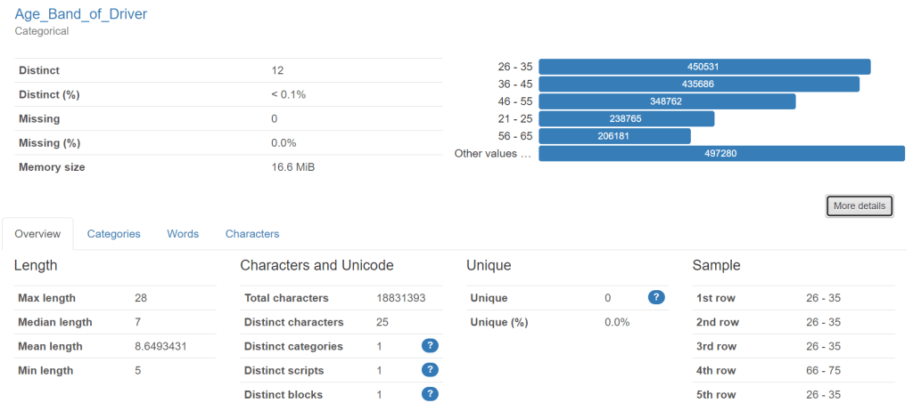
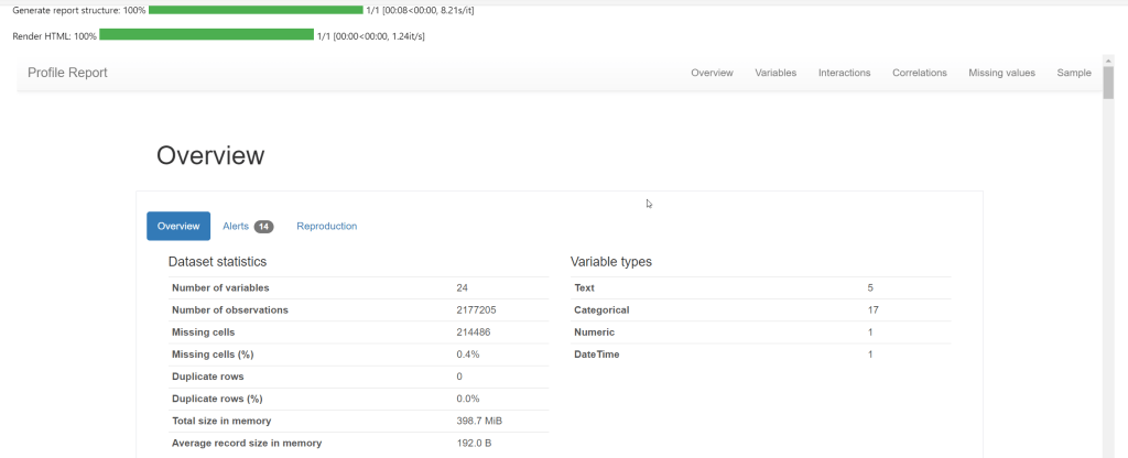
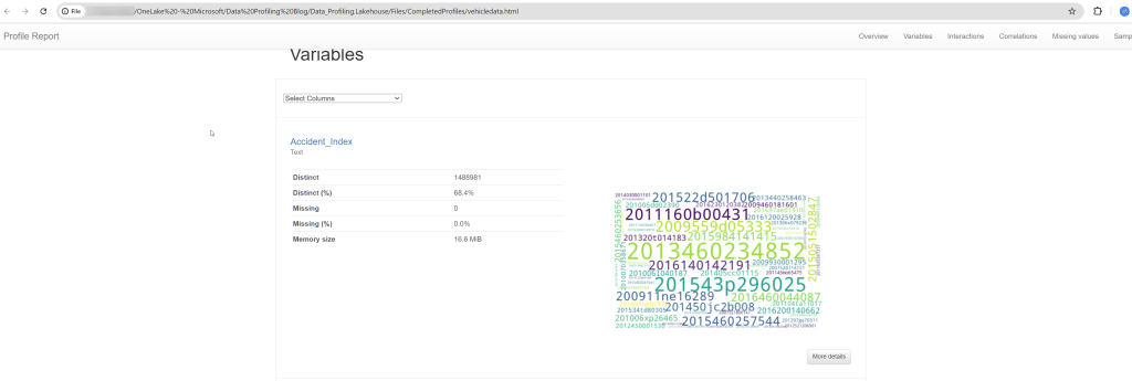
This profile is from traffic accident data – showing vehicles involved. This column is “age band” of drivers.
The profile is a really good way of getting a first look at a set of data to see what condition it might be in. It can provide a “reality check” on the data and help business people to identify rules that they would like “good data” to follow.
Introduction
I’ve been working in data since 2007. For the first half of my career, I focussed on Data Management and developed a specialism in Data Quality. I put everything I learned into my book “Practical Data Quality“.
In 2019, my data career took a different path. As head of data and analytics at an influenza vaccine company, I chose to bring in Power BI. I found I absolutely loved Power BI myself and decided to change my career to focus on that. I’ve been in visualisation roles since and now consult/train on Power BI.
This blog post brings together my two data careers. One of my clients told me that their data profiling tool is no longer available to them and they were looking for a free one to try. I used a free one to demonstrate profiling in my book (Attacama Data Analyzer) but this is no longer free (at least as far as I can see).
Therefore I started to look into other options. A very popular option appeared quickly when I searched – “ydata-profiling” which is available as a Python Library.
This got me thinking… Microsoft Fabric is now a common source of data which needs to be profiled. Fabric’s Notebooks can use Python Libraries… I can now see a really easy way to offer a free data profiling service within Fabric… So that’s what this blog is about – and both my client and I were really excited about the results and the simplicity of attaining them.
Just a note about my style… I sometimes come across blog posts which have an amazing idea in them which I desperately want to implement – but which do not provide every step of a process – either to make the writing process faster, or to avoid people thinking the post is “introductory”. I have taken the approach of showing a full end to end view of how to bring data into Fabric and profile it. For those of you who already know the Fabric part, just skip through to the section with the Notebook.
What is Data Profiling?
Before we go through the mechanism of actually profiling data, I want to be clear about what I mean by data profiling. To quote from my book:
“Data profiling helps to identify the data quality rules that organizations would like their data to comply with by pointing out the “extremities” of the data. Often, these extremities are examples of something that has gone wrong with the data and needs to be corrected. To detect these extremities, a tool typically evaluates all the records in a dataset and provides basic information about each column of data within it.”
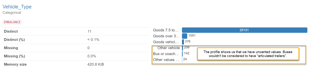
As already mentioned, a data profile is typically used to help generate data quality rules. The rules define whether data is “good” or “bad”. A data quality rule for road traffic accident data might be:
- If the trailer type for the vehicle which had the accident is “articulated”, then the vehicle type should be “goods vehicle”. (Note, what we call an articulated lorry in the UK would be called a “semi-truck” in the US!)
The value of defining a set of rules like this is that they give a measurable value on the quality of data. For example, if there are 80,000 vehicles with the trailer type “articulated” and 72,000 of them are “goods vehicles” then the rule would get a score of 90%. If you imagine a set of 100 such rules, it can provide quite a meaningful view of whether data can be trusted or not holistically. It also allows you to generate a list of “failed” records which can then be corrected. It takes all the uncertainty out of the data quality conversation. The rule can be run on a regular basis to make sure that bad data does not “creep back in”.
The profile is a key tool to help you to identify the need for a rule like this. You can filter the data only to where trailer type = “Articulated”, and then run a profile. The profile might reveal that there are values in the vehicle type field which are incorrect. The teams in the business who own the data may not even have been aware of these incorrect values and therefore didn’t see the need for a rule.
My experience tells me that it’s a really good idea to have a data profiling service in your organisation. Sometimes this might generate data quality rules, but sometimes it can just help to get stakeholders interested in data quality. The profile can sometimes hold some “shock value” when it shows (with very little up front effort) that data is not as reliable as previously thought.
There are many data profiling tools out there. Most of them come with a specific license cost. The approach outlined below is cost free if you already have a Fabric capacity (it will consume a small amount of capacity though – so it is free up to the point that you have some spare capacity).
How can Fabric be used to help with this?
Microsoft Fabric was released by Microsoft in May 2023. It’s a complete analytics platform covering everything from data ingestion (through Data Factory) to data engineering, data science (Synapse workloads) and data visualisation (Power BI). Many organisations will move to Fabric or complement their existing analytics capabilities with Fabric in months/years to come. This means a lot of the data organisations care about will be in Fabric already – just ready to be profiled.
Fabric also allows us to use a number of data coding languages (Spark SQL, PySpark, Spark R and Scala) to work with this data. YData have developed ydata-profiling. This is available as a Python library, which means that we can use it in Fabric on the data which we already have.
We can output the profile as a .html file and view it in any browser.
How is this done in Fabric?
The basic process is:
- Get your data into a Fabric Lakehouse (if it is not there already)
- Create an Environment and make the ydata-profiling Python library available to any Fabric Workspace which needs it.
- Create a Notebook and add in Python code to load a table into a Dataframe and then run profiling on it.
- Output the profile to an .html file and save it on your Fabric Lakehouse in the Files section.
- (Optional): Use OneLake File Explorer to copy the complete profile onto your OneDrive/Computer/SharePoint (if you prefer).
I’ll now outline each step.
Getting your data into Fabric
I won’t try to be exhaustive on this topic because there are fantastic materials already on this from much better Fabric experts than I! Microsoft Learn is very good on this but I also recommend Advancing Analytics, Guy in a Cube, and Radacad. There are many other amazing creators out there too.
For the purpose of making this blog post completely “end to end”, I will cover two common ways to get data into Fabric:
- Upload a file to a Lakehouse
- Use a dataflow gen 2 to connect to some data and write it into Lakehouse tables
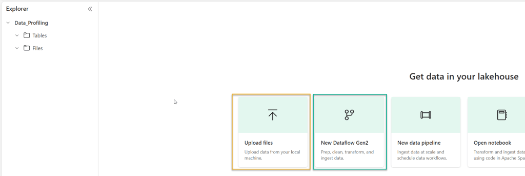
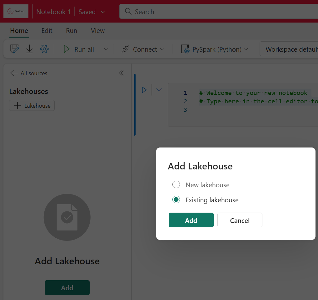
In either approach, the first step will be to create a Lakehouse. Go to a Fabric Workspace where you have appropriate access and click on “new”, and then “more options”:
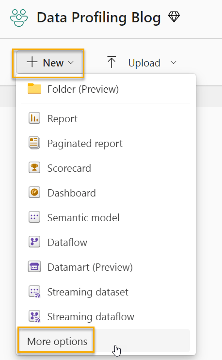
Next, select “Lakehouse”.
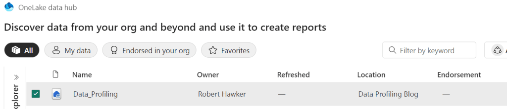
I will call the Lakehouse “Data_Profiling”.
Once the Lakehouse exists, you can start to get data into it. We will use two different methods to do that in this post. The first (and simplest) is to upload a file. The second is to create a dataflow gen 2, to connect to a source (in my example, this will be an Azure SQL Database) and load the data into our Lakehouse.
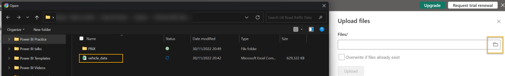
Firstly, lets upload a file. The file we will upload is a large CSV file (600mb) which comes from Kaggle. It’s a set of data about road traffic accidents and the vehicles involved in them. I simply need to click on “upload files” and then find the file on my machine:
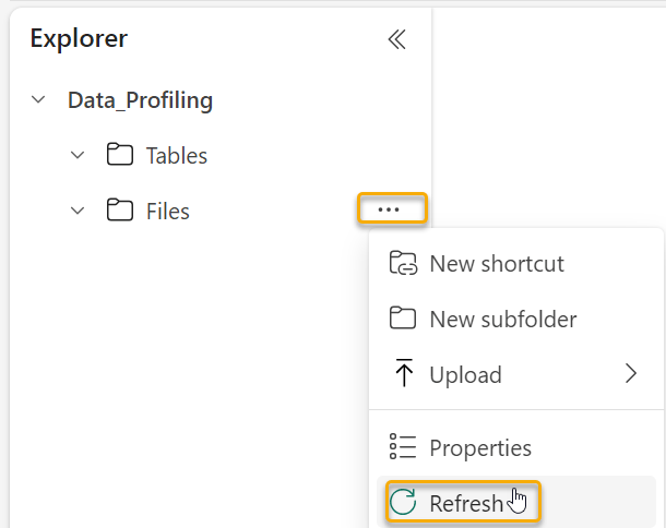
The file (once uploaded) will be available in the “Files” section of our Lakehouse (you may need to refresh the files folder to see it).
We will profile this file later. For now, we will get the second set of data into our Lakehouse tables.
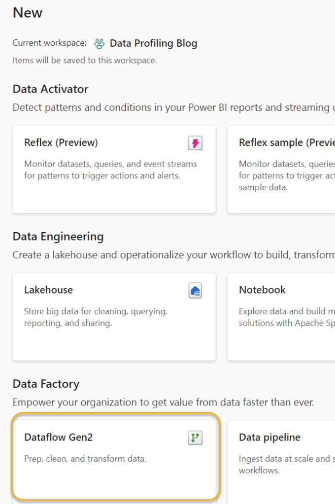
The data is in an Azure SQL server database. I’ve chosen to create a Dataflow (Gen 2) to get this data into a Fabric Lakehouse. In our Workspace, we will create a new Dataflow by clicking “new” and then selecting “more options” as before.
Once you’ve selected to create the Dataflow Gen2, you will be presented with this set of options:
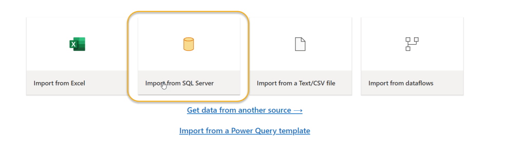
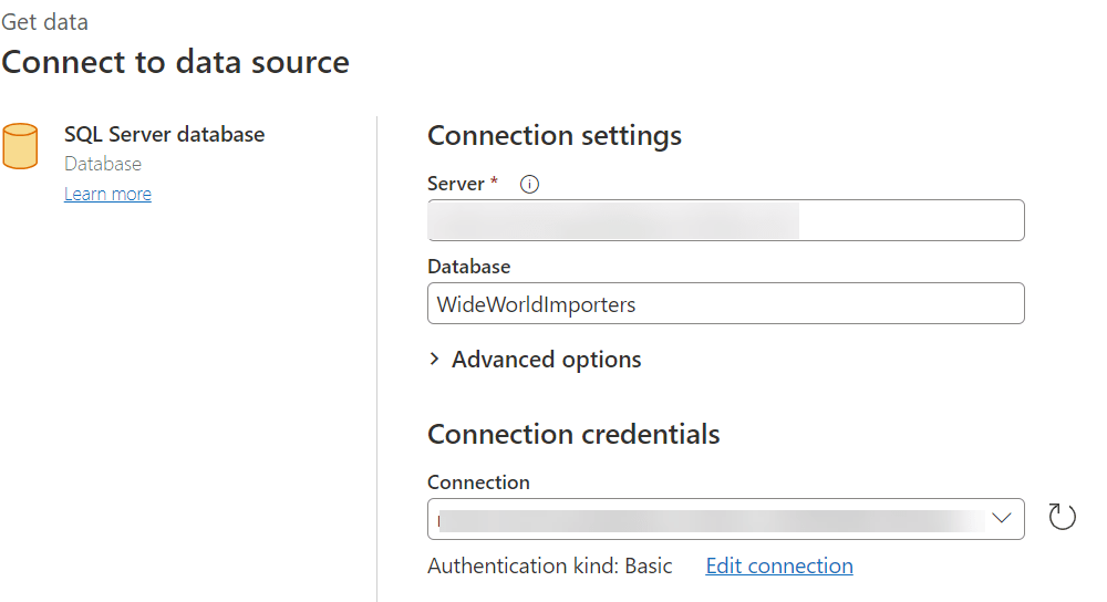
As my source is an Azure SQL database, I will select Import from SQL Server. I will then input the server and database details:
When I click “Next” I am presented with the list of tables in the Database, and I can choose any that I want to profile.
I’ve chosen the tables I use the most in my Power BI Training courses.

Next, we see the familiar Power Query interface with the list of queries and the menu options to clean/transform the data. Here is where we see one of the main differences between Dataflows Gen1 and Dataflows Gen2 – we see the ability to add a “data destination”. This means that our Dataflow can write data into a target structure – like a Warehouse or Lakehouse. We want to profile the data in our Lakehouse, so we will choose “Lakehouse”.

On this screen, we can just click “Next”. We then need to define which Lakehouse we want the data to load into. We will choose the “Data_Profiling” Lakehouse we created earlier.
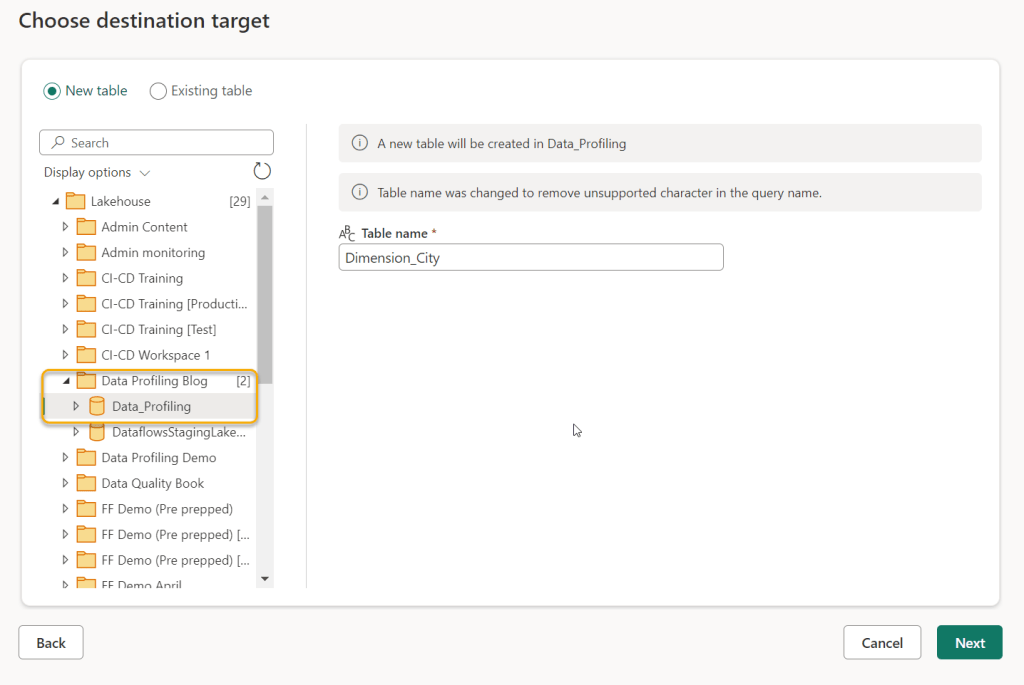
The next screen gives you the option to set up the data types and select the fields you wish to map into the Lakehouse table. Generally, using the automatic settings is fine. Unfortunately the data destination has to be set up for all the various queries (Dimension City, then Dimension Customer and so on). (If there is a way to do this for all queries at once, please let me know!). For the purposes of this Blog, I will set up just the Dimension City and Fact Sales tables to land in the Lakehouse. Once all the queries you want to profile are set up with a Destination, click “Publish”. The Dataflow will automatically publish and refresh. The refresh will load the data into the Lakehouse.
If you now click on the Lakehouse, you will see the new tables.

We now have tables from our SQL database to profile, and we have a large CSV file of Vehicle data to profile in the “Files” section of our Lakehouse.
Setting up for profiling
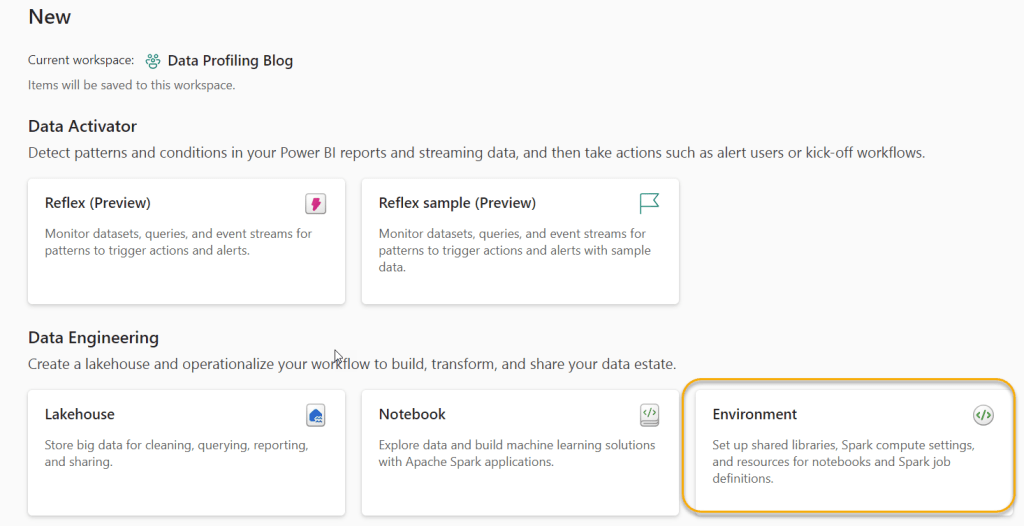
Before we can use the ydata-profiling Python library, we need to make it available to for our Fabric Notebooks. To do this, we need to create a new Fabric Environment.
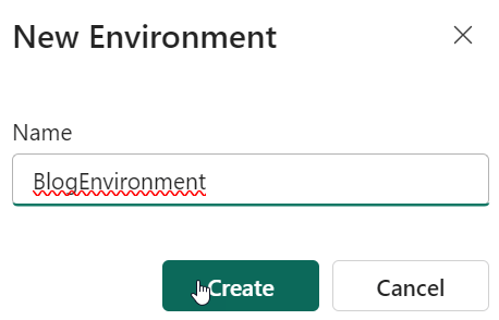
The easiest way to do this is to return to the Workspace, and click “New”, this time selecting “Environment”.
We now need to supply a name for our environment:
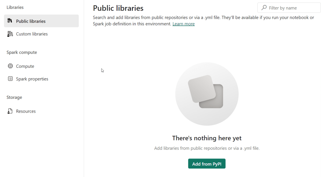
We now need to add a new Library into the Public Libraries section by clicking “Add from PyPI”.
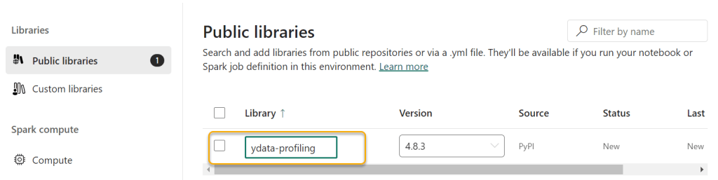
As soon as we type in “ydata-profiling” into the highlighted box, the correct version appears. You can select older versions, although this shouldn’t be necessary.
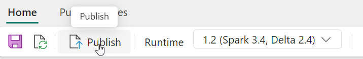
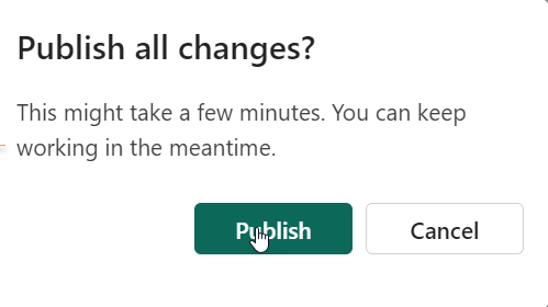
Once you’ve done this, you can click “Home” and then “Publish”, and then “Publish all”
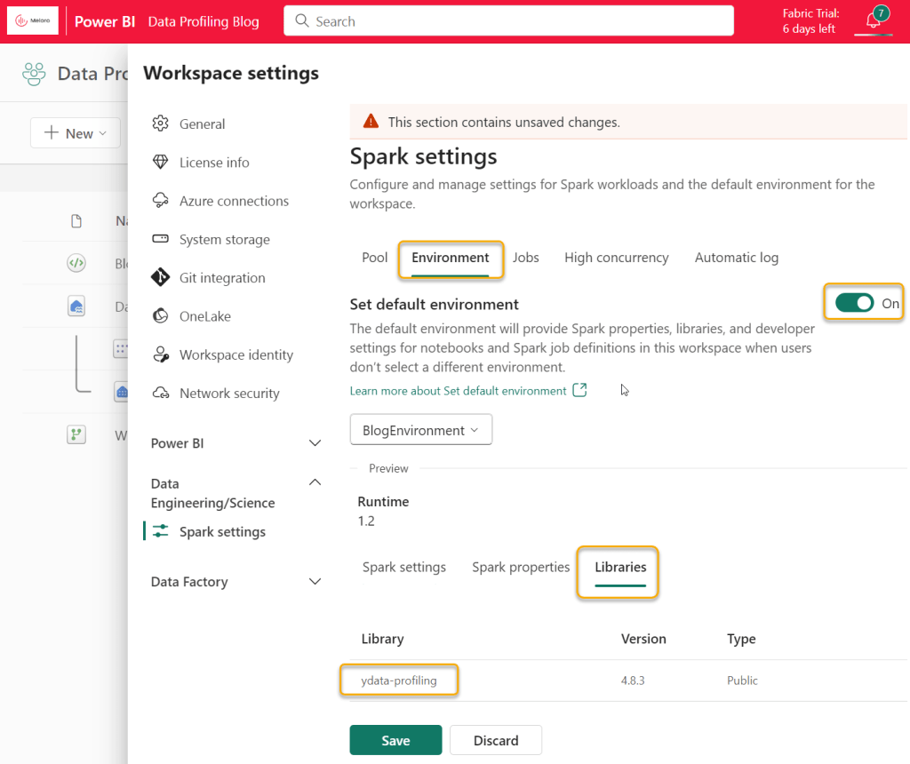
This will take a few minutes to complete. Once it is complete, then return to the Workspace, click on “Workspace Settings”, Data Engineering/Science and “Spark Settings”. Turn on the “Set default environment” toggle, and you will be able to select your new environment and see that it includes ydata-profiling. Click Save.
This completes the “set up” of our environment and we are now ready to profile!
Note that all of this set up is a “one off exercise” and doesn’t need to be repeated.
Profiling files
The blog so far has covered a lot of “pre-work”. For organisations using Fabric as their main data platform – none of this will be needed. Data will naturally be in Lakehouses and profiling will be a simple exercise on top of the Lakehouses. That is why I see this solution as quite powerful.
To do our profiling, we need to create a Notebook. A Notebook is a place where we can write Python code and call our ydata-profiling library. For those of you who do not like code, please don’t worry, this is very straightforward. Note that I am certain the code can be optimised (I am not a coder myself).
To create the Notebook, return to the Workspace and click on “New”, “More Options” and “Notebook”.
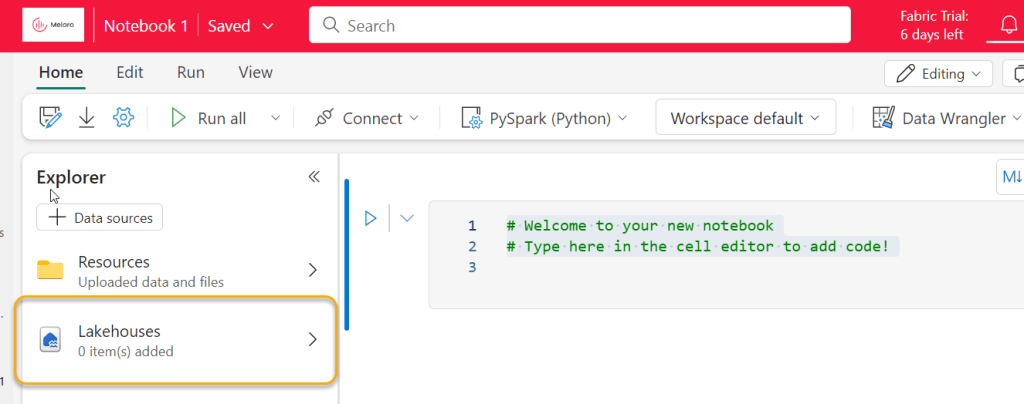
Our first task is to link the Notebook to our Lakehouse. Click “Lakehouses” and then “Add”, then “Existing Lakehouse”
Then add the Data_Profiling Lakehouse we created:
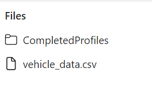
Our “Files” folder should now appear, and it contains our “vehicle_data.csv” file

We will now load the data from our vehicle_data.csv file into a Dataframe in our Notebook. Our ydata-profiling library wants the data to be in a Pandas dataframe. However, with my example file, I get errors when loading using Pandas initially, so I am loading initially using Spark.

This now gives us the code (in a new Notebook cell) to load the data from the file into a Spark dataframe.
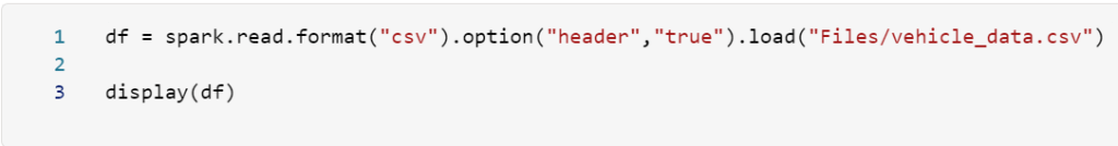
Here’s the code:
df = spark.read.format("csv").option("header","true").load("Files/vehicle_data.csv")

display(df)
Now, we need to convert this dataframe into Pandas, because this is what the ydata-profiling requires. To do this, we will add some lines of code to call Pandas into our Notebook, and we may as well call ydata-profiling at the same time. To do this, we need to add:
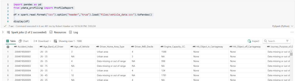
import pandas as pd
from ydata_profiling import ProfileReport
Next, we need to convert our Spark dataframe into Pandas. To do this we add “toPandas()” to the end of the existing df code. This gives the following:
import pandas as pd
from ydata_profiling import ProfileReport

df = spark.read.format("csv").option("header","true").load("Files/vehicle_data.csv").toPandas()

display(df)
If we run this (pressing the small triangular button to the left of the code), we get to see the data we’ve loaded from the file:
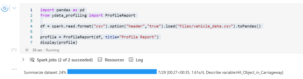
Now we can profile the data. To do this, we need to add the following lines of code:
profile = ProfileReport(df, title="Profiling Report")

display(profile)
The first line tells ydata-profiling to take the dataframe and then create a ProfileReport. The second line tells the Notebook to display the profile result. We can now delete the display(df) line because we do not need to see the dataframe any more.
Here is the code now:
import pandas as pd
from ydata_profiling import ProfileReport

df = spark.read.format("csv").option("header","true").load("Files/vehicle_data.csv").toPandas()

profile = ProfileReport(df, title="Profile Report")
display(profile)
Once you start to run this code, the Notebook will display a status bar:
Once the status bar completes, the profile will display! Now we are getting somewhere!
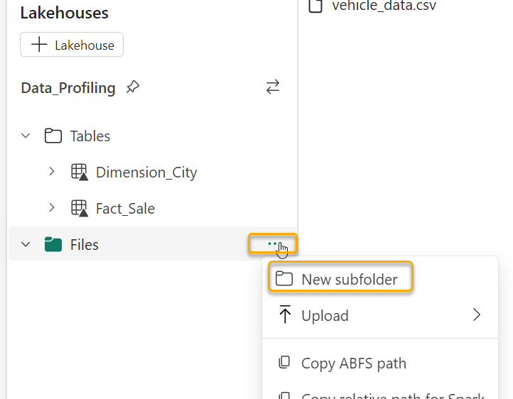
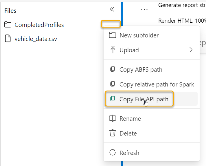
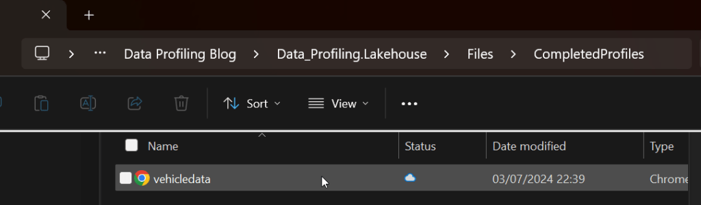
The final step is to save the profile into an .html file. This is useful because you can view it later in a Browser (e.g. Chrome/Edge). We can save this into the Fabric Lakehouse “Files” section. I created a folder in the “Files” section called “CompletedProfiles” to hold the html files.
To create the html file, we can use the following lines of code:
dflocation = "/lakehouse/default/Files/CompletedProfiles/vehicledata.html"

profilefile = profile.to_file(dflocation)
The “dflocation” provides the folder name and a file name for our new html file. To obtain this location, you can click on the ellipses next to the “CompletedProfiles” folder (or whatever you called your equivalent) and select “Copy File API path”:
The profilefile code tells ydata-profiling to write the profile into the datalocation.
We no longer need the “display(profile)” code. The final code is as follows:
import pandas as pd
from ydata_profiling import ProfileReport
df = spark.read.format("csv").option("header","true").load("Files/vehicle_data.csv").toPandas()
profile = ProfileReport(df, title="Profile Report")
display(profile)
dflocation = "/lakehouse/default/Files/CompletedProfiles/vehicledata.html"
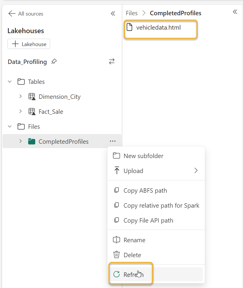
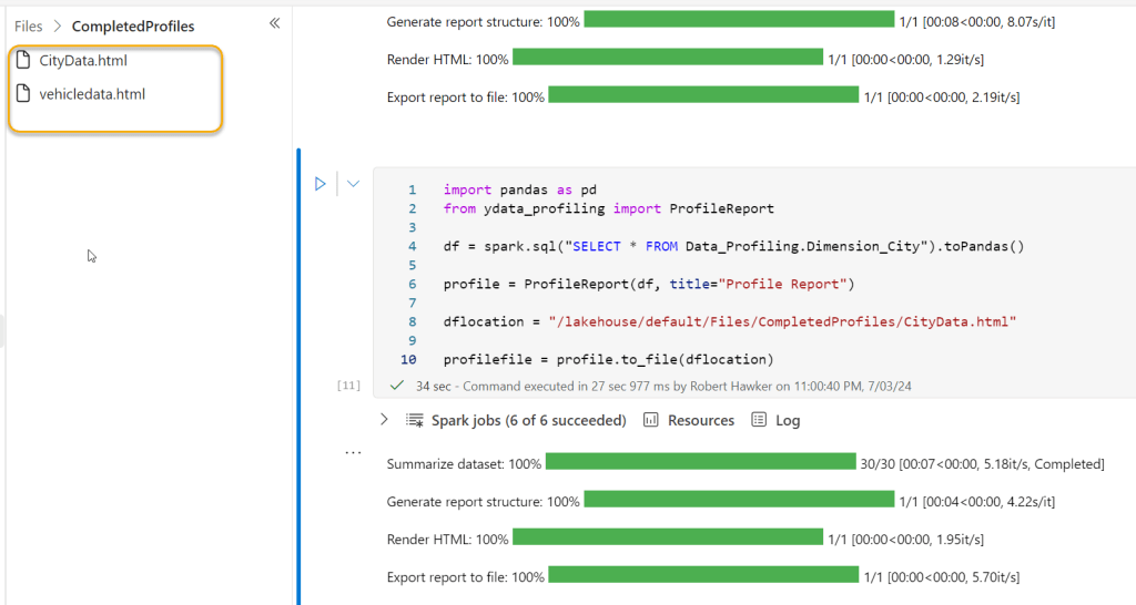
profilefile = profile.to_file(dflocation)Once this code has run, the vehicledata.html file will be in the CompletedProfiles folder (you may have to refresh as shown):
The best way to view the file is to use the OneLake Data Explorer. Please review Microsoft’s documentation about this and install it on your machine. Once you’ve done this, you will see the OneLake data through your File Explorer on your machine.
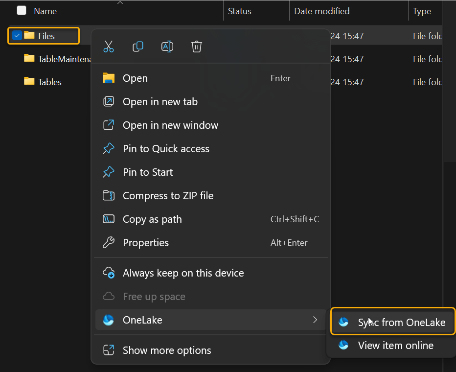
You may need to “Sync from OneLake” as shown to see the html file
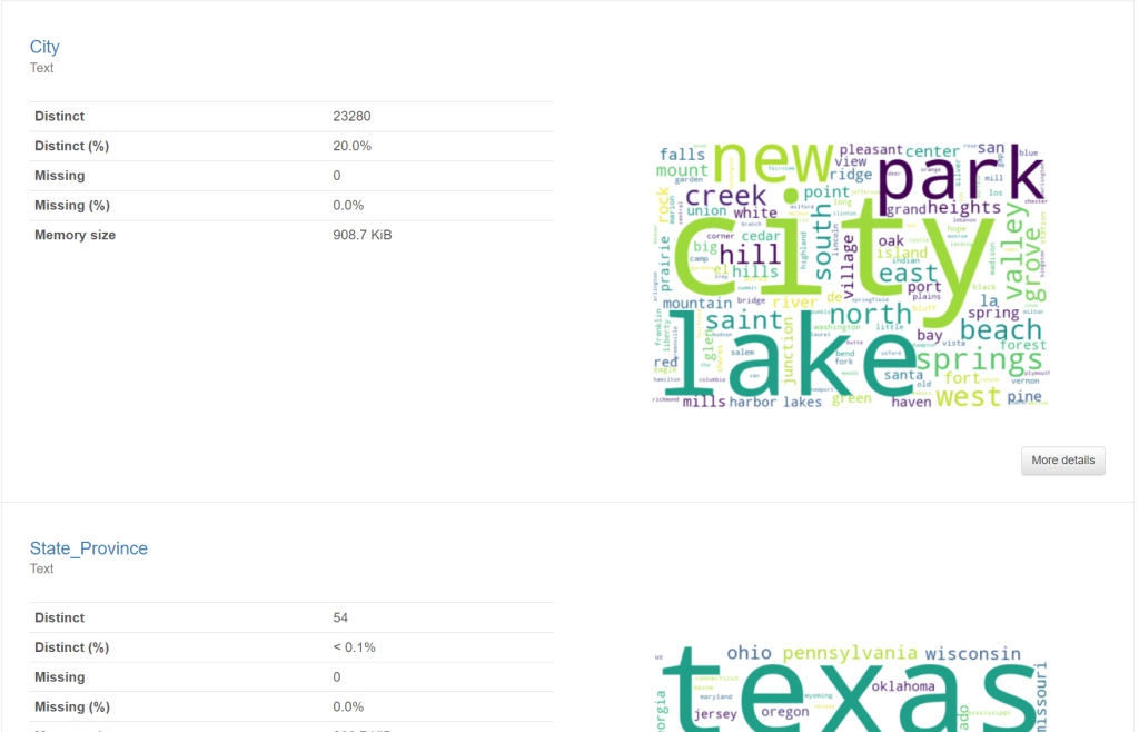
Here’s the profile – now viewed through the browser:
Profiling Lakehouse Tables
The process to profile Lakehouse tables is very similar to the process to profile files. We just need to load the data into our dataframe slightly differently.
Just like with the File data, we can get the right code from Fabric to load our Dimension_City table into a Spark Dataframe:
This creates a new code block as follows:
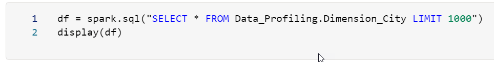
Notice that this contains a SQL statement. This is because the data is in a Lakehouse table. Notice that we have “LIMIT 1000” at the end of this statement. This means only the first 1000 rows will be added to the dataframe. We want to remove this because data profiling does not really add the same amount of value if we only look at the first 1000 records. We need to see the anomalous data across the whole population.
Now we can use the code from our file profile, and combine it with this new code, as follows:
The highlighted parts are the only parts which are different. We have our new code to load our Dimension_City data and we have renamed the output html file.
This produces the following result:
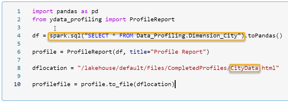
Here’s the code in a copyable format:
import pandas as pd
from ydata_profiling import ProfileReport

df = spark.sql("SELECT * FROM Data_Profiling.Dimension_City").toPandas()

profile = ProfileReport(df, title="Profile Report")

dflocation = "/lakehouse/default/Files/CompletedProfiles/CityData.html"

profilefile = profile.to_file(dflocation)
And finally, here is a screenshot of the html file viewed through the OneLake Data Explorer in Chrome:
I hope that you find this method of getting data profiling up and running within Fabric useful.
Please let me know if you see anything you would improve in this process – I will continue to work on this – for example, creating a more parameter driven code base which will allow users to select the table / file that they want to profile without having to edit code, but I felt that this was useful enough for now to be of value.
Happy profiling!

Amazing! Love the usecase but how can we export this data as a DELTA table?
I am thinking of creating a consolidated view of all my delta tables in the LH. I need only need numeric stats and no charts. how can I achieve that?
LikeLike
Hi Abhay, I’m really excited you found the post useful. Thank you for commenting.
To do this, you can write the report out as a .json file instead of an HTML. Here are the relevant commands (from YData’s website).
# As a JSON string
json_data = profile.to_json()
# As a file
profile.to_file(“your_report.json”) –For this line you would need to put the file path of where you want the JSON file to be saved your Lakehouse.
Once you have json files in the Fabric Lakehouse, you would be able to read them into a DataFrame and then write the results into a Lakehouse Table.
I hope this helps!
Rob
LikeLike